Logo Creation
Project Scope
The team requested a streamlined, modern logo that effectively integrates multiple divisions and combines two systems. The primary focus was on aircraft maintenance, encompassing all global Air Force operations.
The challenge
Designing a streamlined, modern logo that comprehensively represents all facets of the Air Force is essential. This includes fleet maintenance, aerospace, IT, mechanics, squadron/commander levels, and HQ operations, ensuring each area is equally represented.
Start
After consulting with various officers to understand their goals and the shortcomings of the current logo, I began my research. I explored common elements in aircraft design, letterforms, flight pattern terminology, and potential shapes for enclosures. My aim was to create a mark that would work well as both a logo and a patch.
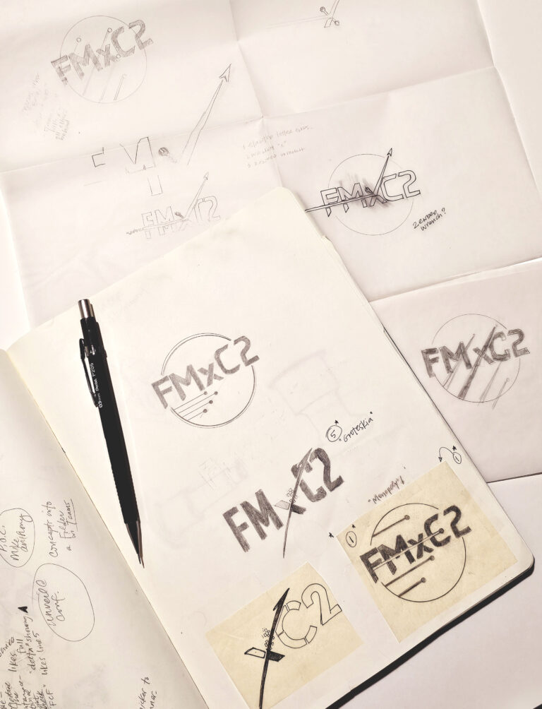
This research inspired several sketches, which I then presented to the team. Their feedback helped refine these ideas, leading to the development of three digital concepts that incorporated the most favored elements.


The Process
I began by sketching with graphite in my sketchbook, using tracing paper to build on the initial sketches. This approach allowed me to repurpose elements, make adjustments, and add or remove details with minimal erasing. Additionally, I used a digital tool called Milanote to organize inspiration, images, and research terms, and to experiment with color concepts.
Once the sketches were scanned, they were incorporated into a presentation. These images were then imported into Adobe Illustrator CC for digitization, where I developed three refined concepts.

The Result
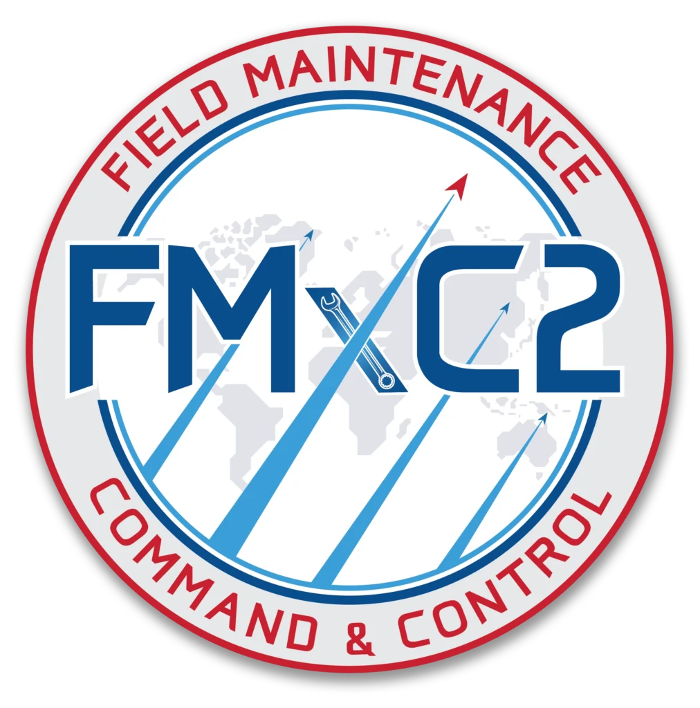
The typeface was initially sourced from a modern, free commercial download and customized with adjusted letter widths and angle details. The “2” was sourced from a different typeface to enhance the design. Angular flight streams were incorporated to symbolize the sharp, precise inclines that aircraft undergo during post-maintenance testing. The four triangles represent aircraft and are arranged in a “finger four” formation, a nod to a traditional fighter formation. Additionally, the design features a prominent wrench to symbolize maintenance and various operational areas, while a subtle map element highlights the global scope of the Air Force.
Conclusion
The team was highly satisfied and impressed by how the complex request was distilled into a single, cohesive mark. The final design successfully balanced inclusivity with a minimalist approach.
