The project involved updating the established Coors logo and expanding the branding to encompass the entire brand family. Additionally, with the launch of Heavenly Decks, we included its branding in the scope of work.
kickoff
Our CEO, our Copywriter, and I met with the Coors owners—a husband and wife team—to discuss their wish list, concerns, growth goals, and timeline.
overcome obstacles
The original Coors branding was bright and primary-colored, giving off a bargain-brand vibe. This led to quote requests but few closed deals. To reflect a more upscale standard and deter bargain hunters, we revamped the color scheme to better align with Coors’ luxury positioning.
Additionally, the new sister company, Heavenly Decks, introduced deck building services with a strategy that highlighted their unique market niche, addressing an underserved segment in their industry.
Original Logo
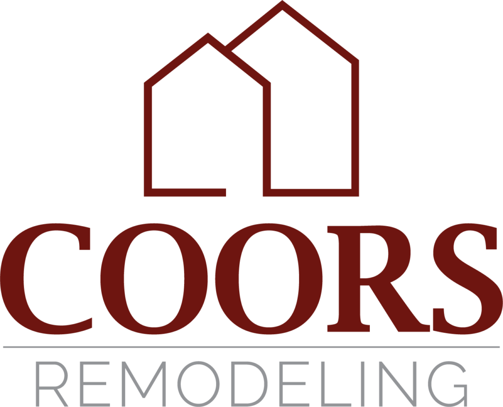
New Logo
coorsremodeling.com
Adding Depth
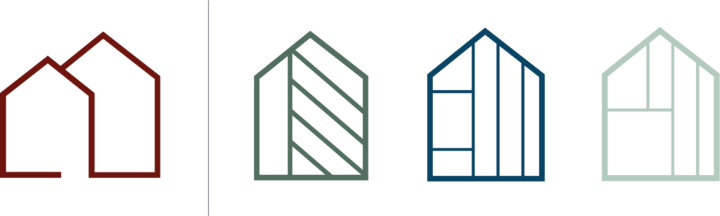
To maintain brand recognition, the original color scheme was deepened, and new colors were added for each sub-brand. We highlighted the sub-brands to make them more prominent, even though they were part of Coors’ business all along.
I began with simplified sketches echoing the original logo and designed distinct smaller icons that still resonated with the parent brand. A new sans-serif typeface was chosen for its weight and character, enhancing the “premium” look.
Parent brand with the 2 sub-brands
teamwork
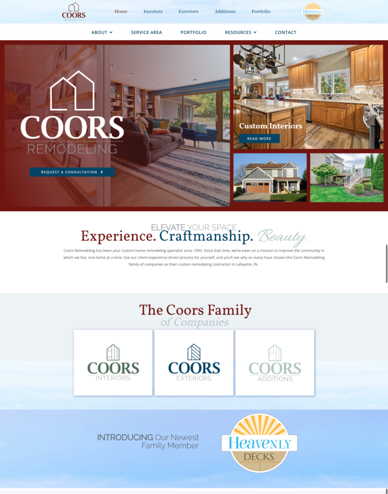
With the branding a success and implemented, the new website became the next focus; a fully branded site that:
Showcase the main brand, introduce the sub-brands
Plan the introduction of their sister company, Heavenly Decks
Represent each brand like it has its own site, all nested in the same domain, built on WordPress
Copywriting for Coors and creating Heavenly Decks
SEO Optimized
Analytics & Data collection
Lead Generation
bring it all together
Simultaneous to the creation of the Coors website, we were also working as a team to bring Heavenly Decks to light.
Branding
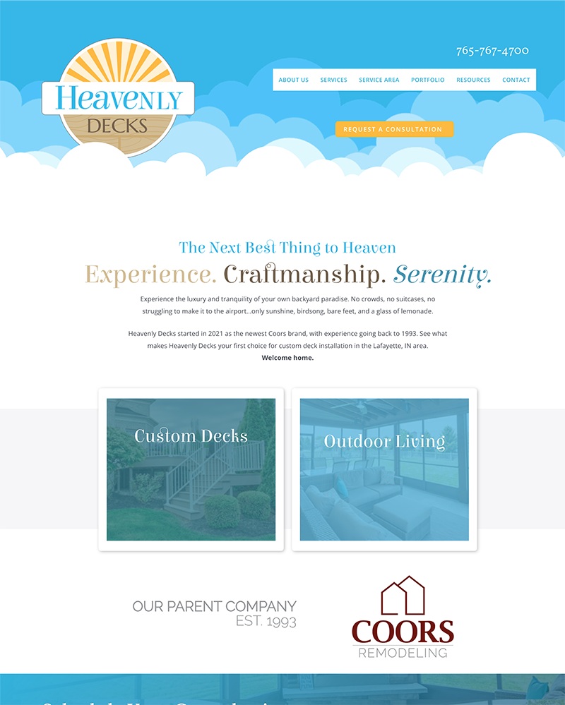
Our challenge was bringing to life this vision from Bart, the owner: “Imagine coming home after a long day at work— get a glass of tea and go to your own piece of heaven, your backyard. Imagine the sun on your face, birds chirping, and complete peace.”
I used subtle woodgrain to a logo and mark that is playful but structured with the badge-like container. The color scheme works with colors commonly seen on a sunny day, and whimsy was brought in with the typography.
Full suite
Heavenly Decks has its own url that redirects to an interior area of the Coors WordPress site, keeping everything under one roof. Inner-linking between the Coors and Heavenly Decks brings immediate equity to the brand with the immediate connection to the recognized Coors brand.